Trinity Law
It can be a risky business move, tying your faith to your brand, but it’s one that has paid off for Trinity Law. Formerly known as Menges & McLaughlin, the attorneys at Trinity Law wanted to take the bold step of building a new brand around their shared Christian principles of honesty, integrity and compassion rather than on the attorneys themselves. The firm has experienced growth and increased trust with their clients as a result.
DESIGN NOTES:
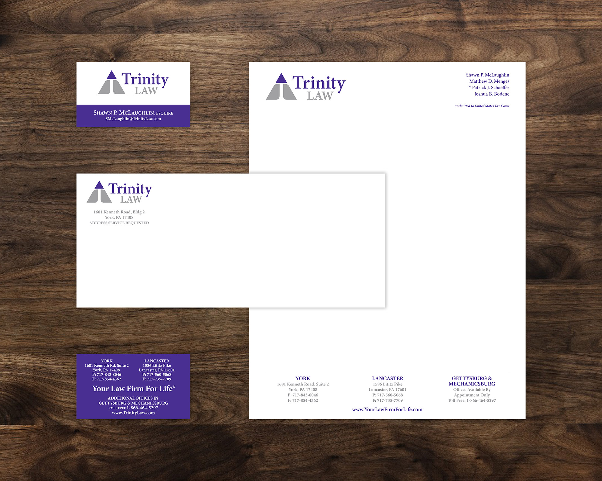
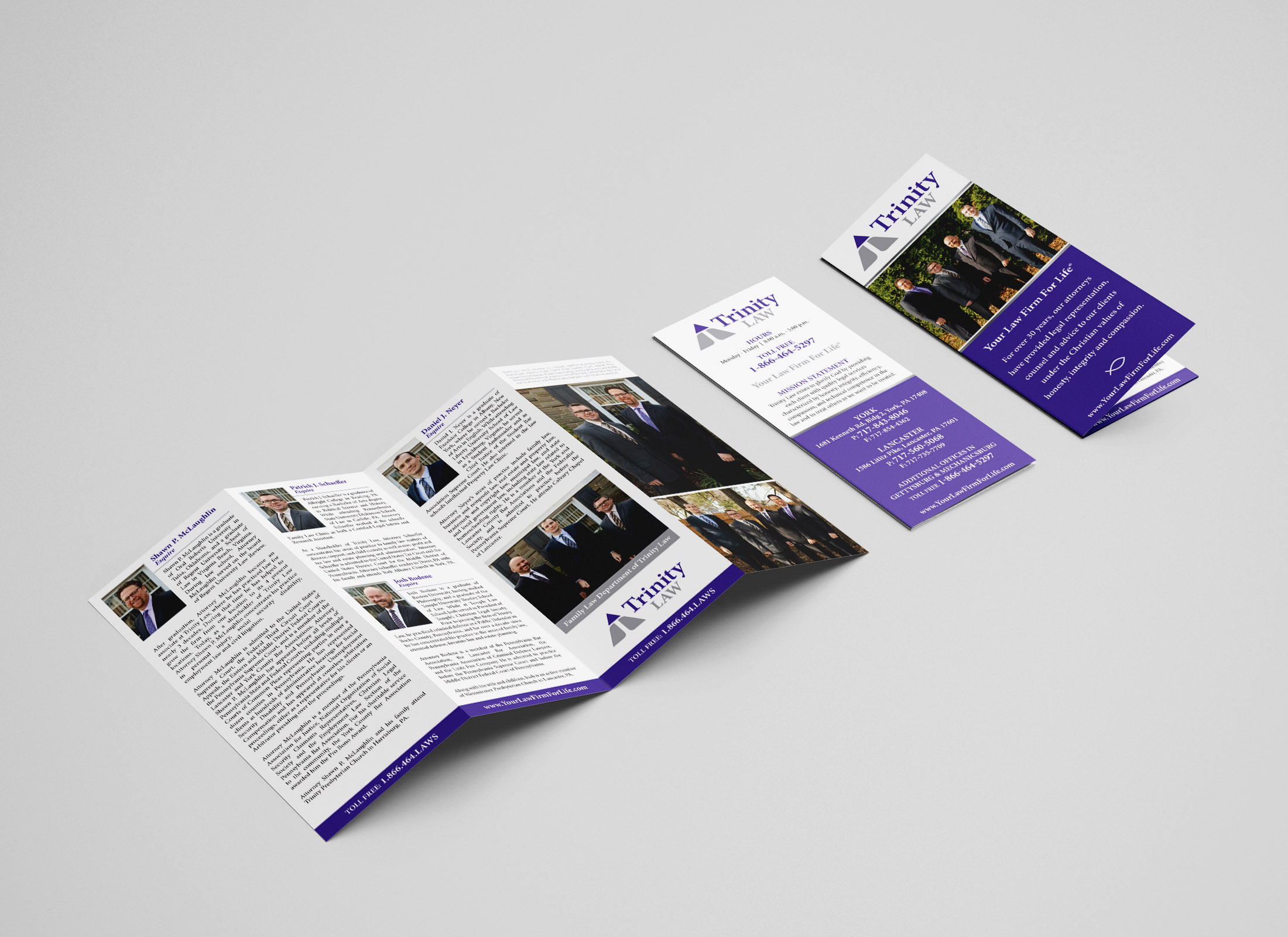
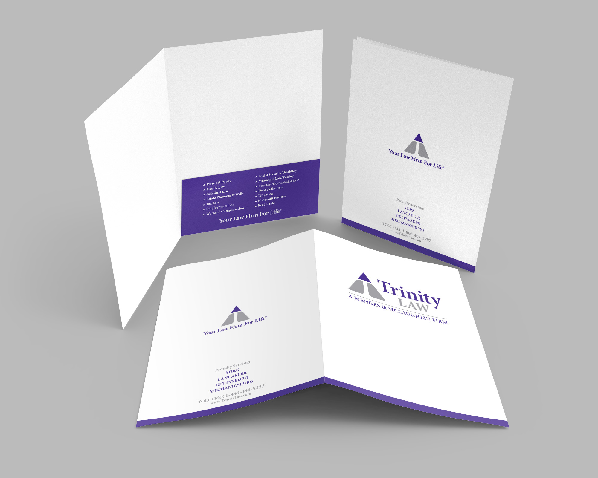
The Trinity (Father, Son & Holy Spirit), is a well known Christian term and it is a core belief in the Christian faith. For this brand application, it can also represent the relationship between the attorney, the client and the sovereign God. Wanting to create an icon to depict the Trinity concept, I started with the triangle, which is also a symbol of strength. By incorporating a “T” for Trinity within the triangle shape, it also breaks the shape up into three segments. I highlighted the top smaller triangle shape to act as an upwards arrow representing God. For the primary color, we chose purple because it was a color that would distinguish the brand from other local firms, and the color purple is symbolic of royalty and authority in Christianity.