

Logos Academy
For parents exploring private education options for their children, factors like geographic location, education philosophy, core values and cost of tuition can influence their decision. The research we conducted showed that Logos Academy was a familiar education option in the community, but many of the details that made Logos Academy distinct were widely unknown. We decided that a simple rebrand would be useful to help refine the school’s identity and attract a new wave of interest in the growing school.
DESIGN NOTES:
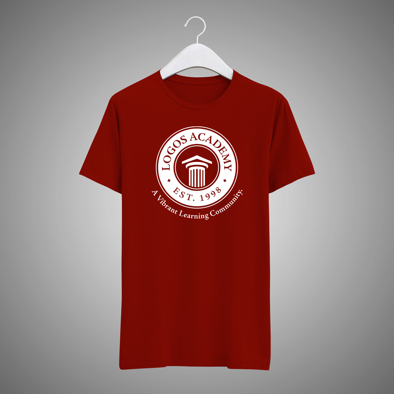
We wanted to keep the existing pillar concept but create a cleaner, more modernized look. The pillar, a symbol of strength and stability, was designed with some added symbolism in mind. The triangular top piece of the pillar mimics a graduation cap, symbolizing academic achievement. It also points upwards as a symbol of the school’s commitment to God through its Christ-centered values. The primary burgundy color was kept the same for an element of consistency.