Doceo
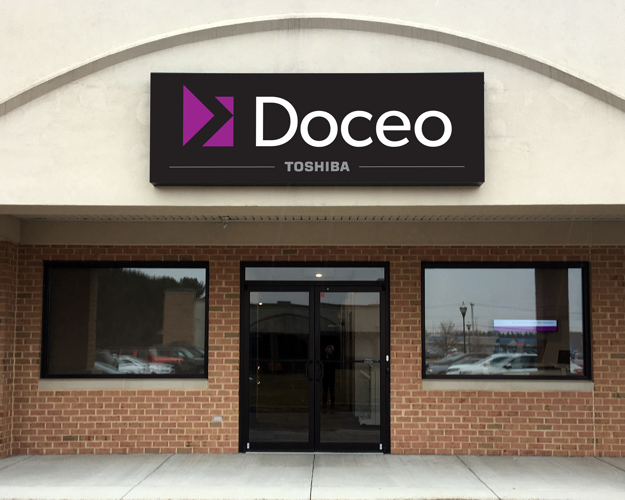
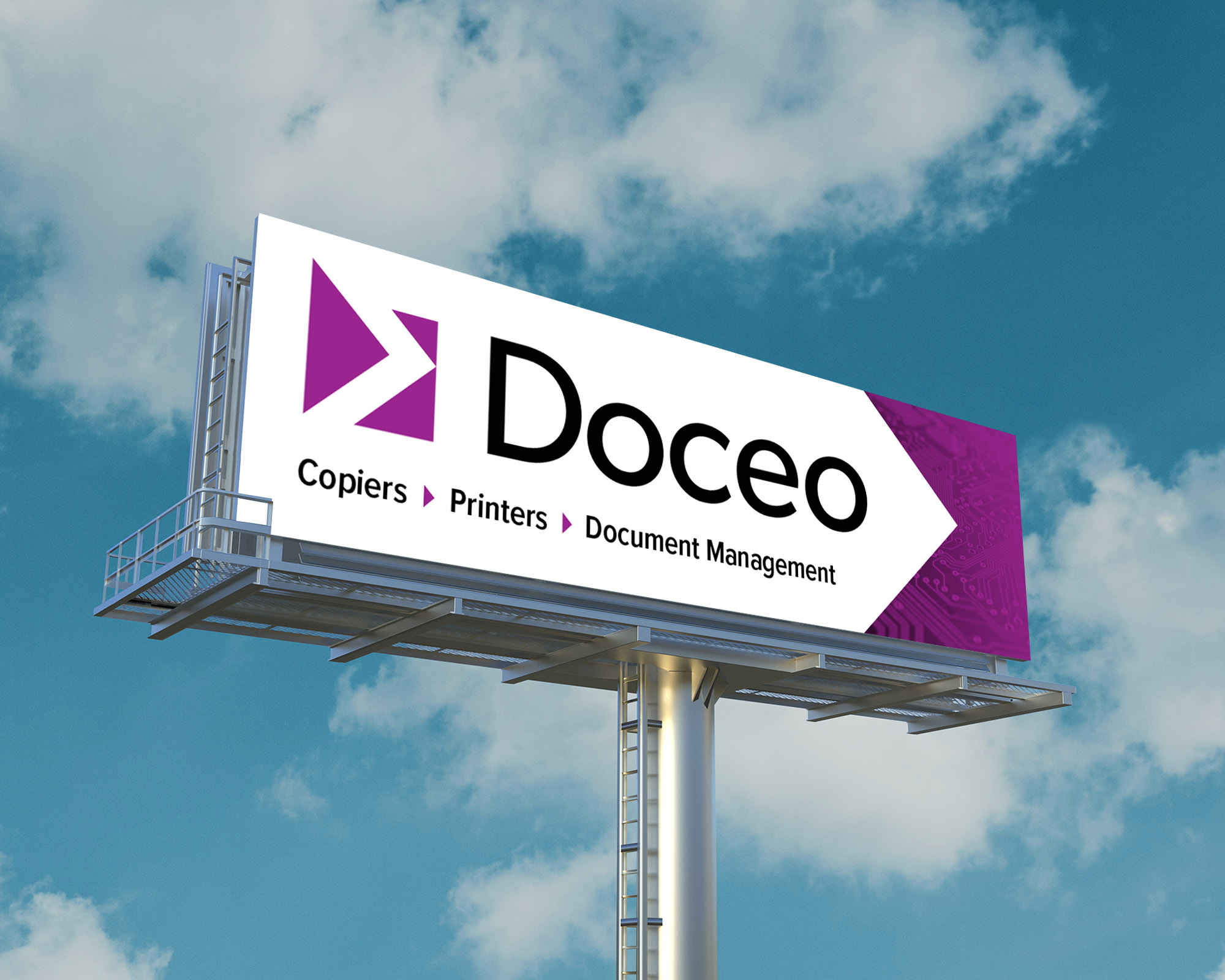
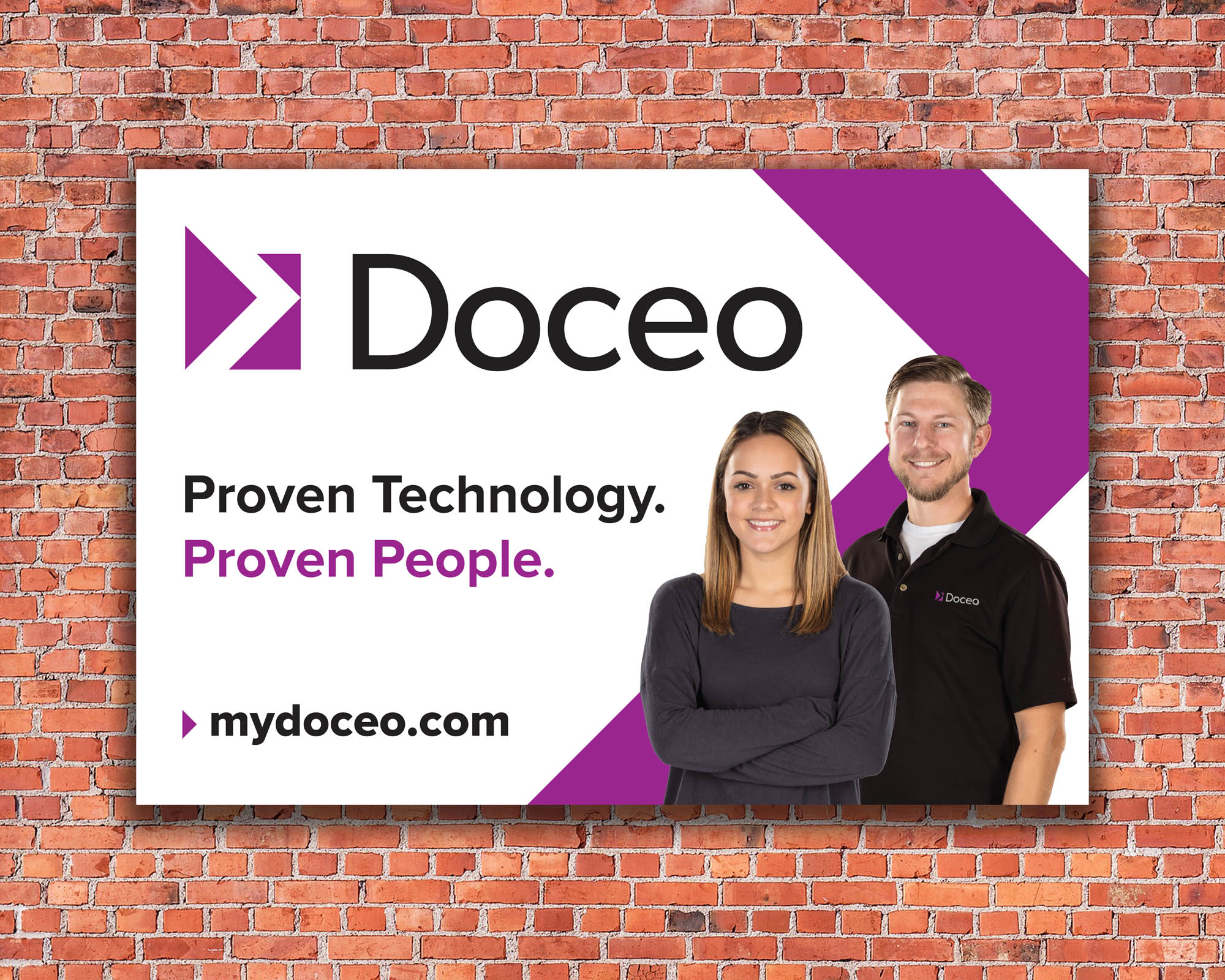
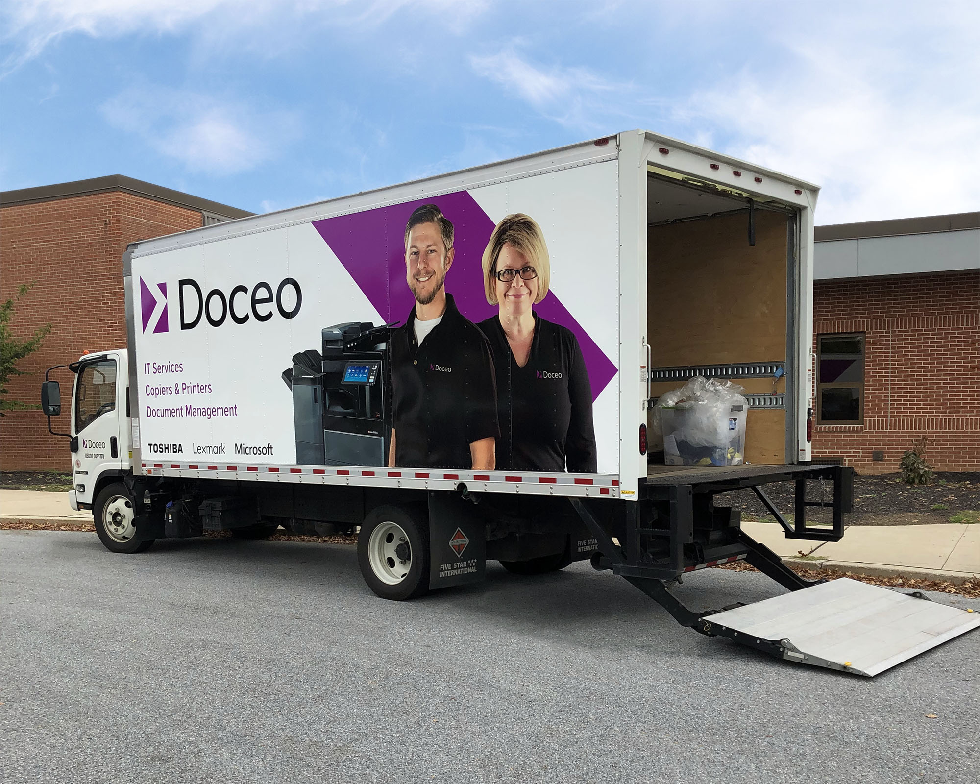
Doceo has had many sub-brands and rebrands during my time working there, but none quite as comprehensive as the rebrand of the original office technology company in 2018. The company was experiencing an industry shift into the world of IT services. At the same time, Doceo was simplifying its service offerings and consolidating its marketing and lead generation sub-brands into one unified brand. The result was to abandon the elements that would typecast it a copier company and embrace a new, modernized brand that could encompass IT services and other future service offerings.
DESIGN NOTES:
Through many stages of logo design concepts, we decided that introducing a unique, abstract symbol would best represent the new Doceo brand. We also decided to remove “Office Solutions,” which was indicative of a traditional copier company, and to move forward doing business simply as Doceo. First though, I suggested changing the Doceo typeface and moving away from using all capital letters (the capital “E” always stuck out to me in ‘DOCEO’). We chose a new sans-serif typeface in which the round shapes of the lowercase letters flowed nicely together. Once we had that nailed down, I came up with the ‘arrow’ icon that could work to represent us as a technology company and to symbolize momentum, growth and energy. In terms of color, purple had always historically been used as our primary brand color in our marketing material. We carried the purple over but selected a vibrant new shade and worked it into the new logo as our primary color.
VIDEO SAMPLES:
Here are some videos that I scripted, shot and edited for our sponsorship of the York Revolution: