
LifePath Christian Ministries
Rebranding can sometimes reflect a change in leadership and vision. For years, the York Rescue Mission grew to be known throughout the community as the place that fed, clothed and sheltered people in need. This was made clear by the market research we conducted, and few were aware of some of the newer services offered such as medical care and job training. The decision was made to rebrand the organization, with the new brand centered around the concept of a complete life transformation. The name “LifePath” came from the initial conversations we had about who the organization was and who they wanted to be. The idea is that each person has an intended path in life and sometimes, whether by choice or circumstance, some drift away from that path and need help finding their way back. LifePath’s vision is to be that resource for guiding people back onto a better path.
DESIGN NOTES:
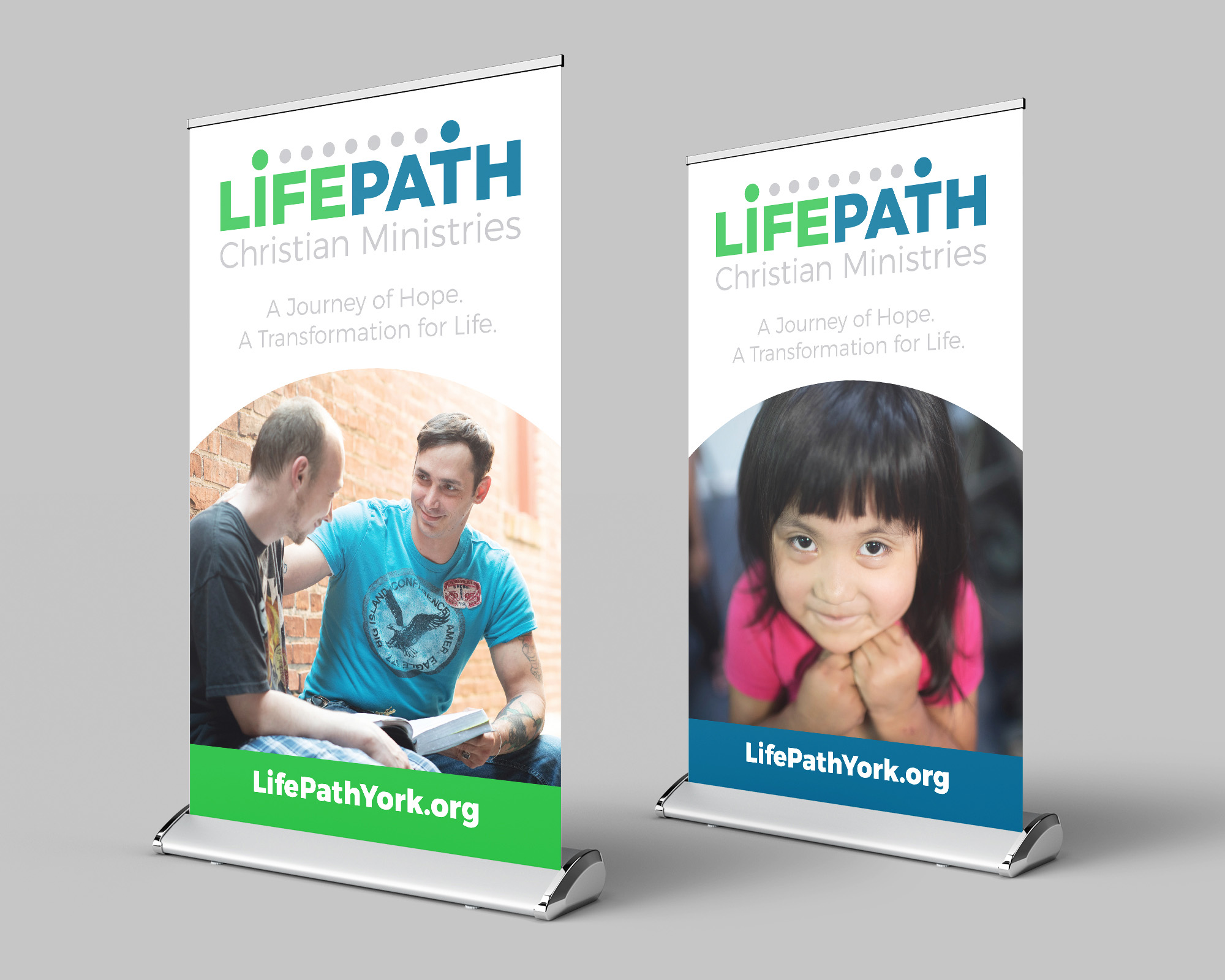
The new brand was very conceptual, and we needed to find a way to visually depict a path of life transformation. I came up with the idea of using dots over the letters to depict this journey, and centering the beginning and ending dots above the ‘I’ and the ‘T’ creates stick figure icons. The blue ‘I’ is a person at the start of their journey, and the green ‘T’ is a person at the end of their journey whose open arms represent freedom and victory. For the color scheme, we carried over blue since it was the previous brand’s primary color, and we added the green because it symbolizes life, growth and action.