


Minnich’s Pharmacy
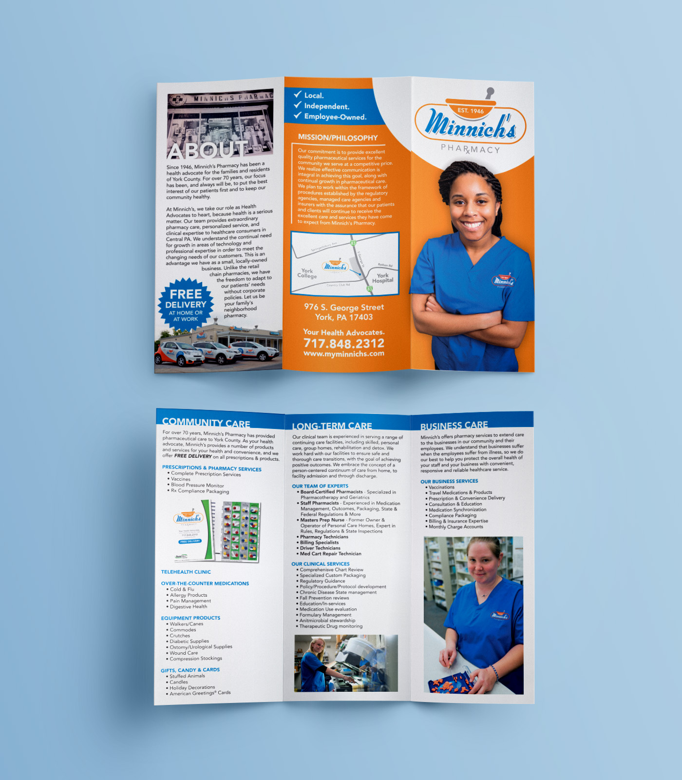
What began as a discussion about vehicle wraps turned into a complete rebrand for Minnich’s, and that developed into several years of marketing and design support. The Minnich’s marketing strategy was built on a foundation of three key pillars; Free Delivery, Employee-Ownership and Health Advocacy. In a “David vs. Goliath” scenario, these are the distinct qualities that separate this independent community pharmacy from its colossal chain competitors.
DESIGN NOTES:
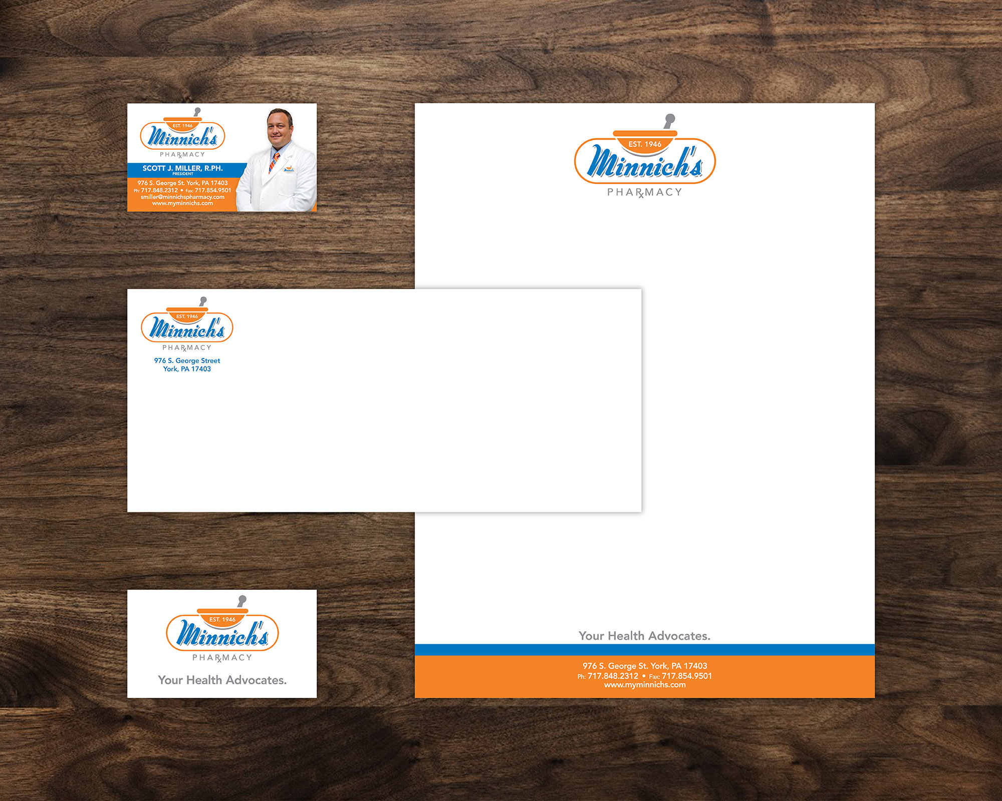
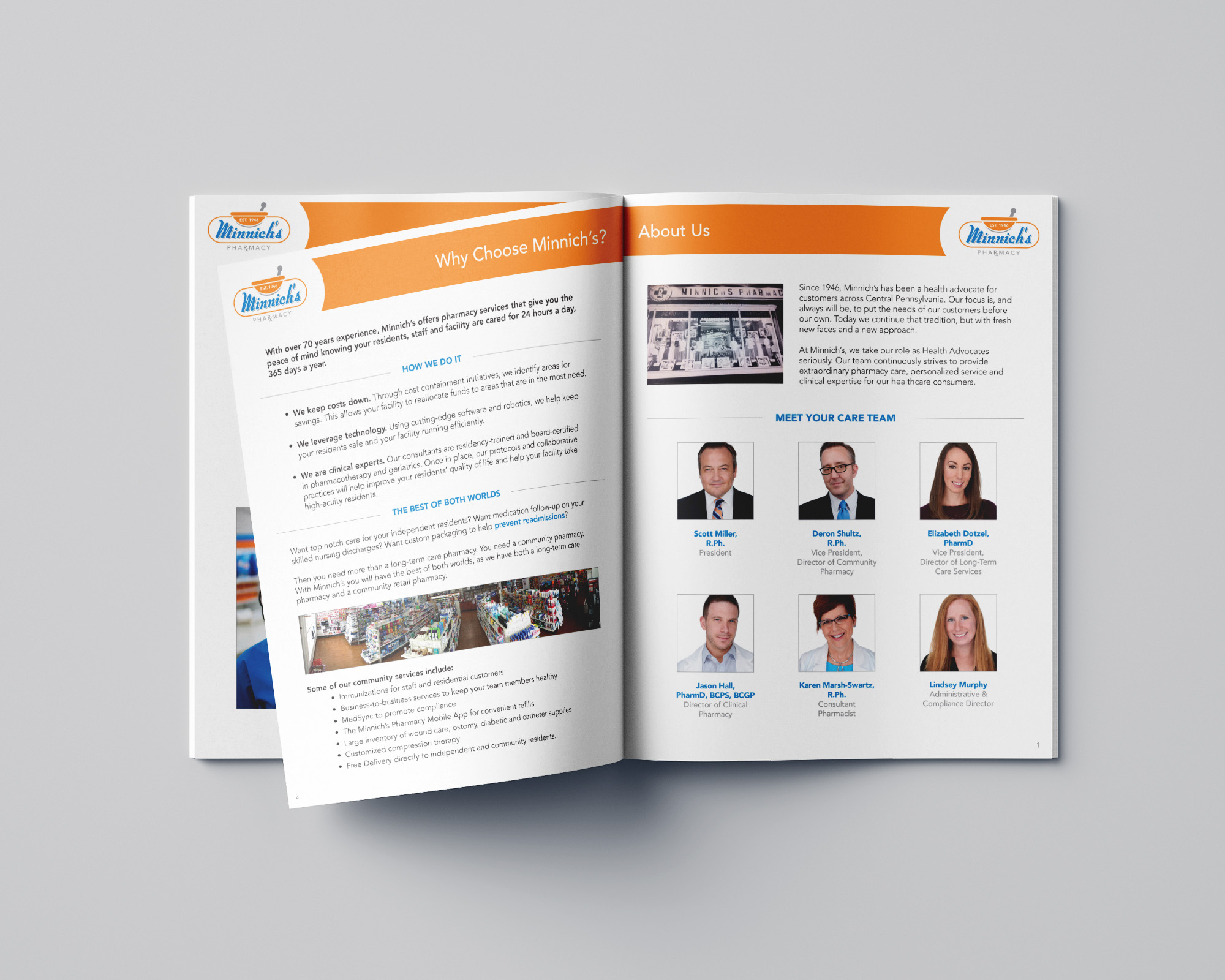
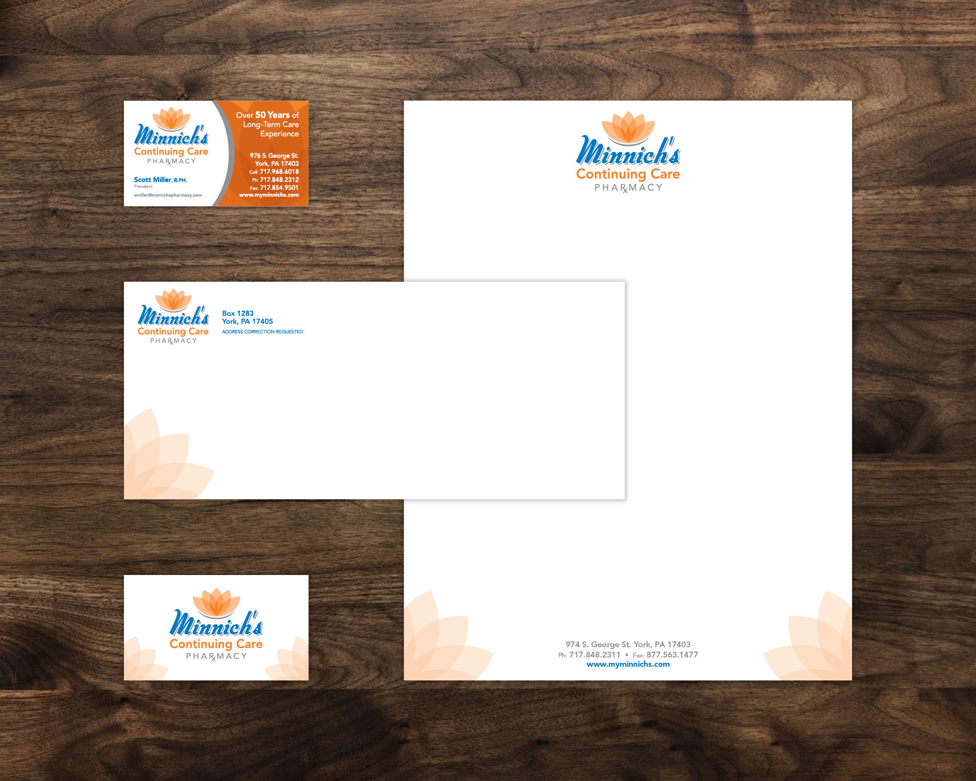
I wanted the logo to have a retro feel, giving a nod to their roots as an independent pharmacy in the community for several decades, while also breathing new life into an outdated and overlooked brand. It was important to give the brand relevancy in an industry that is highly competitive and constantly evolving. The bright, complementary colors are effective for the Minnich’s brand and are used consistently across various applications to give Minnich’s a unified look.