Meadowview Medical Acupuncture
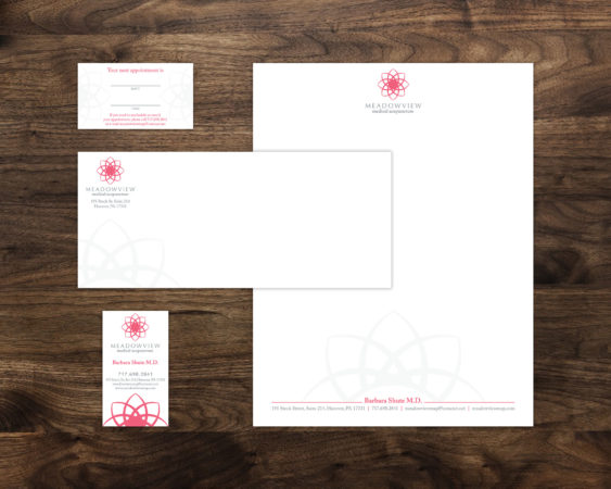
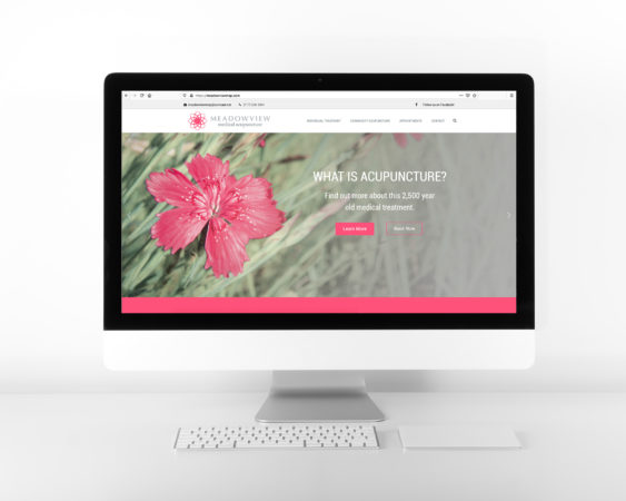
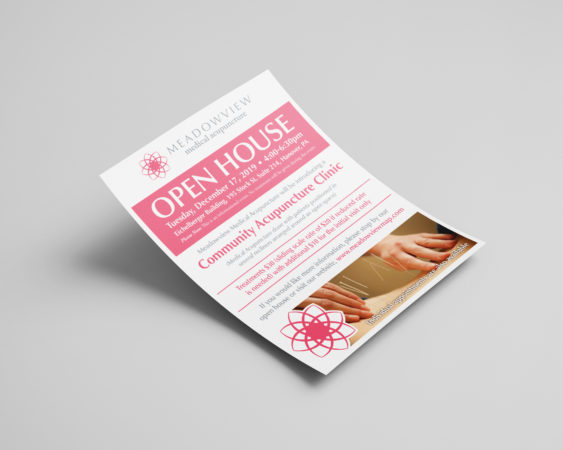
I love when design gives me the opportunity to help people, and in this case, I was able to help my mom rebrand and promote her Acupuncture Practice. This rebrand was unique because her previous logo was one of the first logos I had ever done back in high school. Having the opportunity to rebrand my own amateur work as a professional designer was a fun and interesting experience, and I’m really happy with how it came together.
DESIGN NOTES:
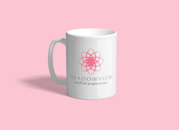
Like me, my mom is very much in favor of incorporating symbolism into artwork (when it works well), and this was a perfect opportunity to explore that together. The flower was a natural choice for the logo icon because it reflected the ‘Meadowview’ name, and it evokes gentleness and and peacefulness. I landed on this particular “lotus” design because the lotus flower has significant meaning in Chinese medicine, and it also allowed me to incorporate 8 points on the flower which represent the 8 influential points of the body in the acupuncture theory. The primary pink color is a warm, feminine color that fits well with the Meadowview branding and proudly represents this female-owned practice.


